BRANDS
  • View All
BRANDS
  • View All
BRANDS
  • View All
FIND A SHOWROOM
BUY ONLINE
INSPIRATION
Products
Brands
Where to Buy
Search
The Coburn Hutchinson House

Michelle Woolley Sauter of One Coast Design

French-Wired vs. Standard-Wired Lamps

Know Your Lighting Terms

Pops of Brass

Five Questions with Christina Goldsmith

April 18, 2019
img

Pops of Brass

Five Questions with Christina Goldsmith

April 18, 2019

Did you ever have that odd room in your home that you keep changing around? You don't really know what to do with it, what purpose it should serve, so you try a few things?

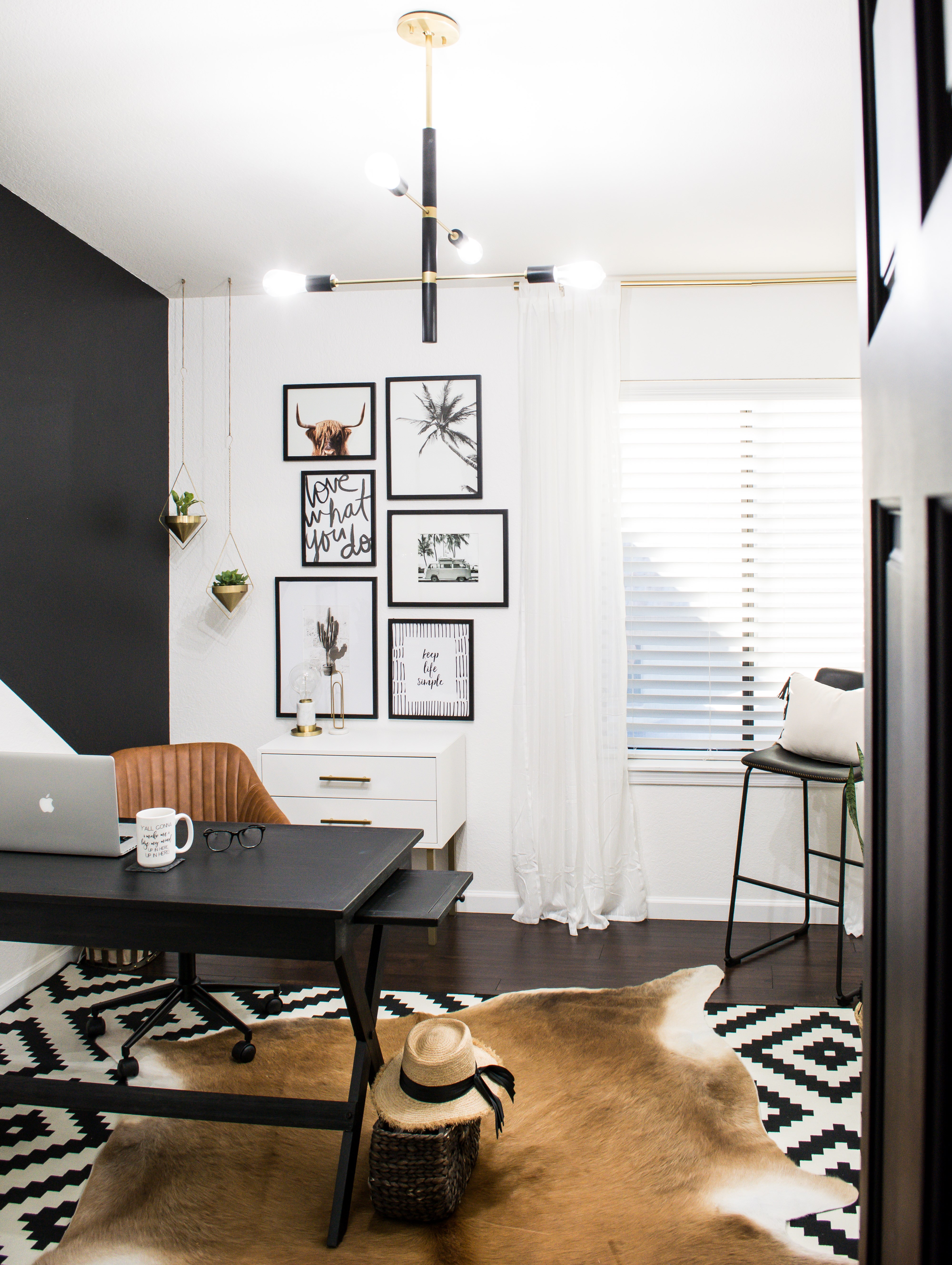
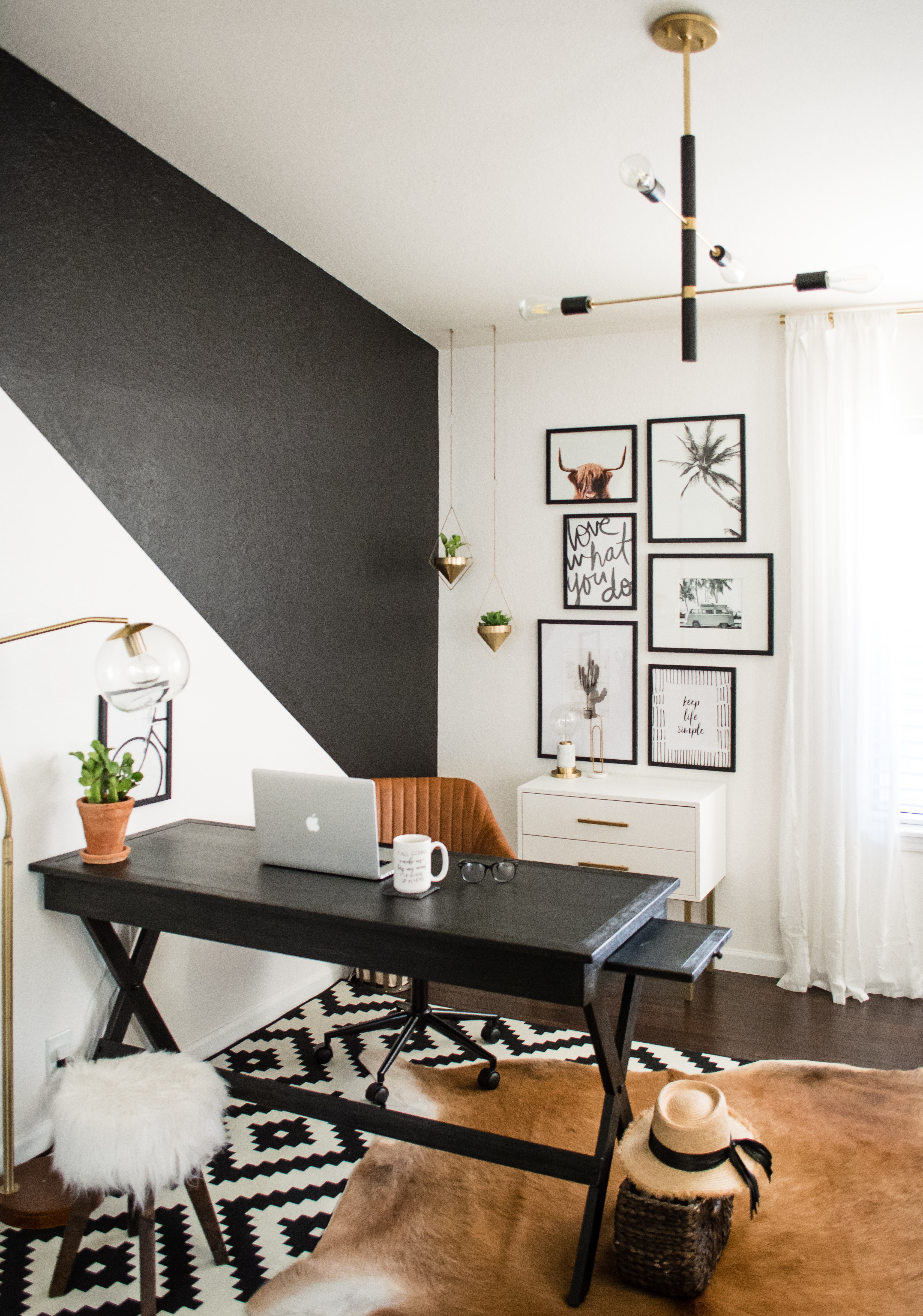
Well, that's what Christina Goldsmith was going through with this space in her house. As she tells us in her blog post on it, it had been a guest room, a walk-in closet, and a transitional "cloffice" before her growing interior design and consultation business dictated this space become committed to serving solely as her home office. She knew she was going for an organic desert vibe; she knew she had a certain budget to work with; and she knew lighting was going to define the space, so she pulled in things from her house, sold off some other no-longer-need items, and connected with us.

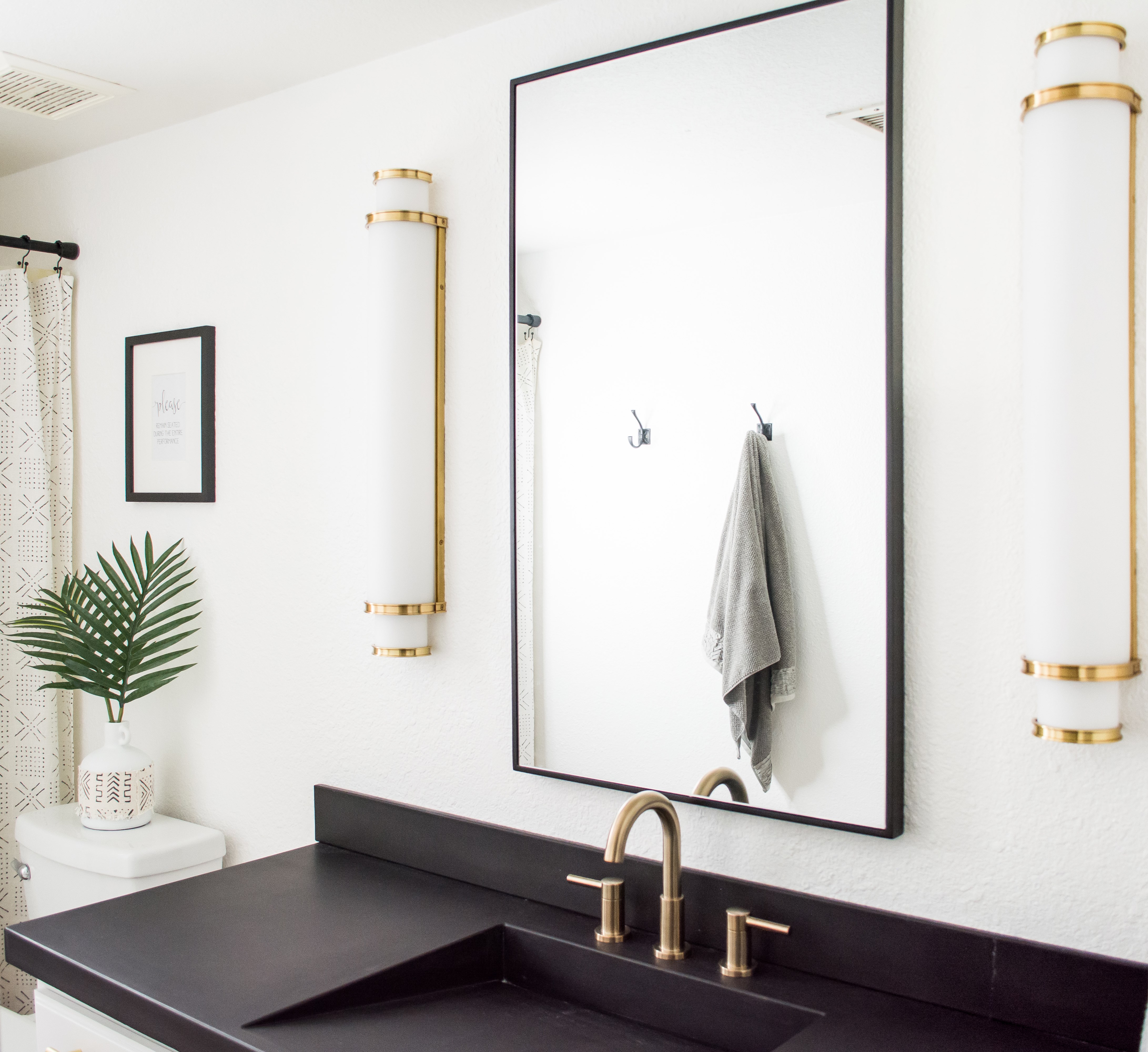
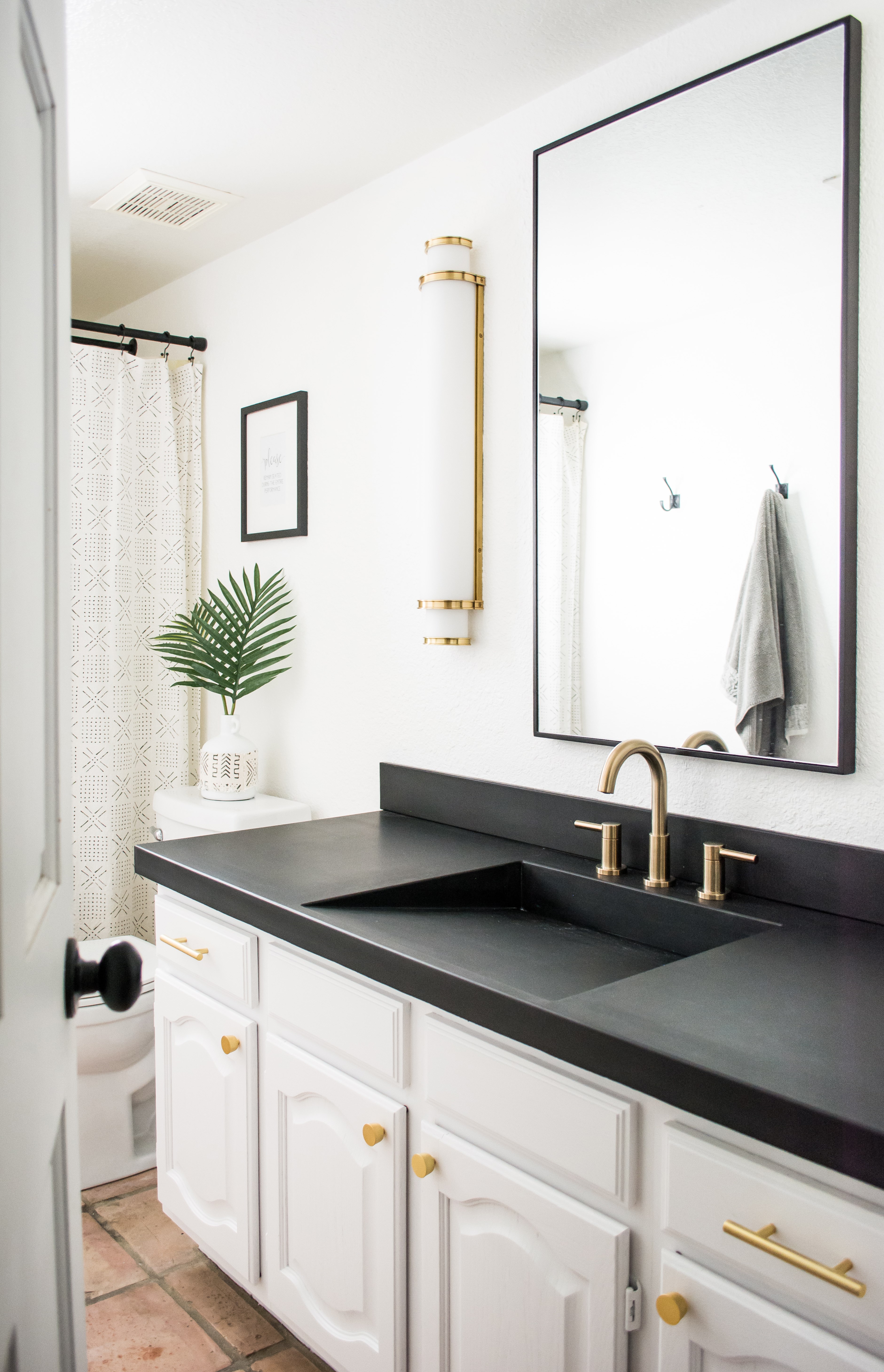
Christina also partnered with us on redoing a bathroom, which she built around her admiration for our Malcolm bath and vanity sconce. You can read about that project and see the before and after here. Christina took some time out of her busy schedule to play five questions with us. Check out her gorgeous room make-overs after the interview. 

 1. What was your inspiration for the design of these two spaces?
My design inspiration usually stems from one piece or a color scheme, and then I build the rest of the design around that. For both of these spaces I knew I wanted something a bit more modern involving clean lines and the timeless contrast of black and white, finished off with pops of aged brass. 

2. How would you describe your style?
I'd say my style is eclectic. I love so many things about several different styles, and it's fun to figure out what works together to marry them all together. There is a difference between eclectic and just buying anything and everything that catches your eye, because not everything plays well with others.  

3. Was the office mostly a DIY update? (Did you paint the two-toned wall yourself, etc?)
The office was a complete DIY update, as are most of my house projects! It's very rare that we hire anything out or I get my husband involved. I usually do the painting, accent walls, furniture assembly and even hang the light fixtures.

4. How does lighting play a role in the bathroom and office? What elements do you look for when choosing lighting for yourself, as well as your clients?
Lighting always plays a huge role in any design. I refer to it as the "statement jewelry" or the "cherry on top" because it can literally make or break a room design. It will either pull the room together or make it seem unfinished. When selecting lighting for myself and for my clients I look for statement pieces that pull all elements of the room together through the lines, the finishes and amount of light it gives off so it's appropriate for the space (i.e. Do we want something that sets the mood, or do we want something that illuminates a space?).

5. Love how you use neutral color palettes while keeping your home so interesting and stylish. What’s your advice on how to keep it neutral, but not boring?
While I admire the use of color in design because it's so visually interesting, I personally lean toward neutrals because of their calming effect. The best way to keep a neutral palette just as visually interesting and stylish as a colorful room is through the use of layering, pattern and texture. The combo of those three elements are not only visually pleasing to the eye, but add a level of comfort and coziness. Neutrals also make it easy to add pops of color when you want it!


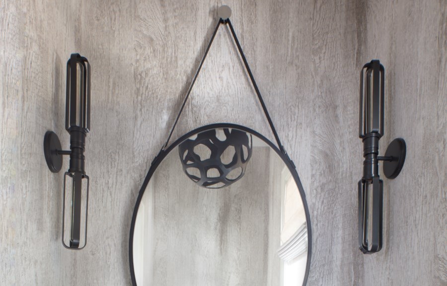
Design: Christina Goldsmith | Light: Astrid by Mitzi


Design: Christina Goldsmith | Light: Astrid by Mitzi


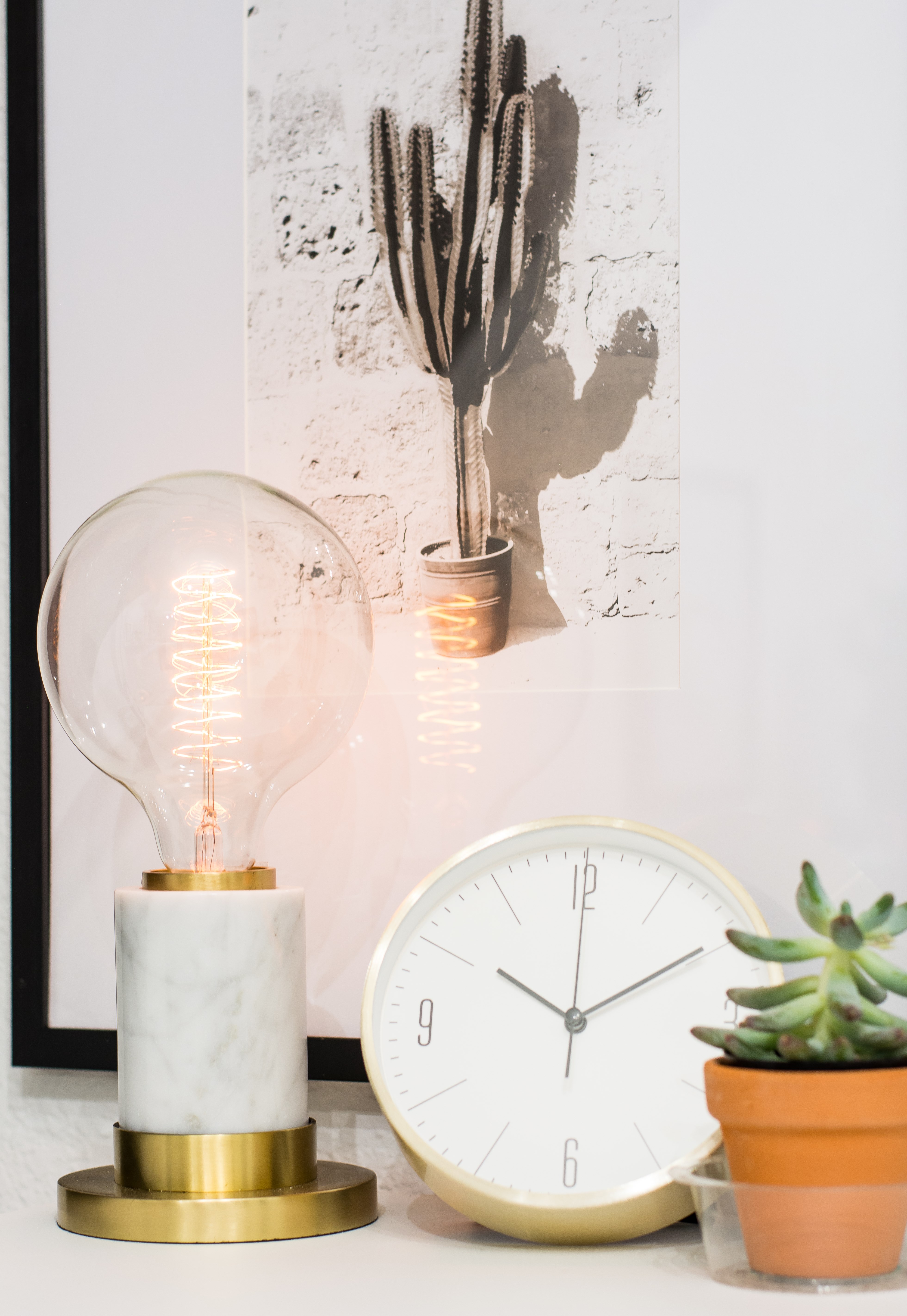
Design: Christina Goldsmith | Light: Asime by Mitzi


Design: Christina Goldsmith Interiors | Light: Malcolm by Hudson Valley Lighting


Design: Christina Goldsmith Interiors | Light: Malcolm by Hudson Valley Lighting